HEEM
Client: HEEM (an end-to-end furniture e-commerce app with augmented reality feature)
Challenge: Create an augmented reality feature for users to engage with the app and eventually lead to revenue.
Role: UI+UX Designer (Research, Visual Design & Interaction Design)
Result: Within 80 hours over 4 weeks, HEEM has an established brand, a consistent visual direction for the app, and a functional prototype with the augmented reality feature implemented.
RESEARCH & DISCOVERY
Methods used: Market & industry research +Competitor Analysis + provisional persona
Market & Industry Research
eCommerce trends for furniture is growing quickly and in 2017, eMarketer reported that online sales of furniture and home furnishings grew by just over 16% and sales soared to nearly $36 billion. That number is expected to exceed $60 billion annually over the next three years.
Quick shipping, low prices and special online only offers give consumers a tempting incentive in shopping furniture online.
The rise of AR technology also enhance consumers to be able to visualize how the furniture looks like in the house. Virtual layouts help consumers to make quicker purchasing decision as well.
AR technology also fills the gap between browsing online catalog and visiting a physical store, which effectively increase revenue and shorten the decision making time. And provide a “try out” time for consumers.
In addition to industry research, I followed up with looking at both online and offline/direct and indirect competitors including IKEA, Wayfair, houzz, DesignMatters and Pottery Barn. From then, I could identify the strengths and weaknesses of these furniture and home goods stores.
I also created provisional personas which embody demographic and behavioral traits that match HEEM’s potential users. Provisional personas helped me identify people who might be an ideal interview subjects and consider how I might want to frame my interview questions and planning.
SYNTHESIS & DEFINITION
Methods Used: Empathy Map + Persona+POV Statements+ HMW questions+group brainstorming
In synthesis stage & with the data collected by observing 5 participants’ think, feel, hear, and online shopping behaviors. These findings provide me lots of useful information to look for their needs and insights, I continued with creating empathy map, persona.
From observations to insights to needs, I came up with 3 needs that users have most concern with :
Users need to access to accurate specs information.
Users need to know the product’s quality to match with the price.
Users need to touch and feel the products to be confident in final purchase.
In addition, I created provisional personas to help understanding more of potential users’ sweet spots and pain points of using e-commerce app.
After creating personas, I began creating a POV Statements + HMW Questions documents. By looking back at the insights and needs, I came up with POV Statements and lead to “How Might We” questions. A set of HMW questions help me define and identify users’ need and prepared myself to move into ideation process.
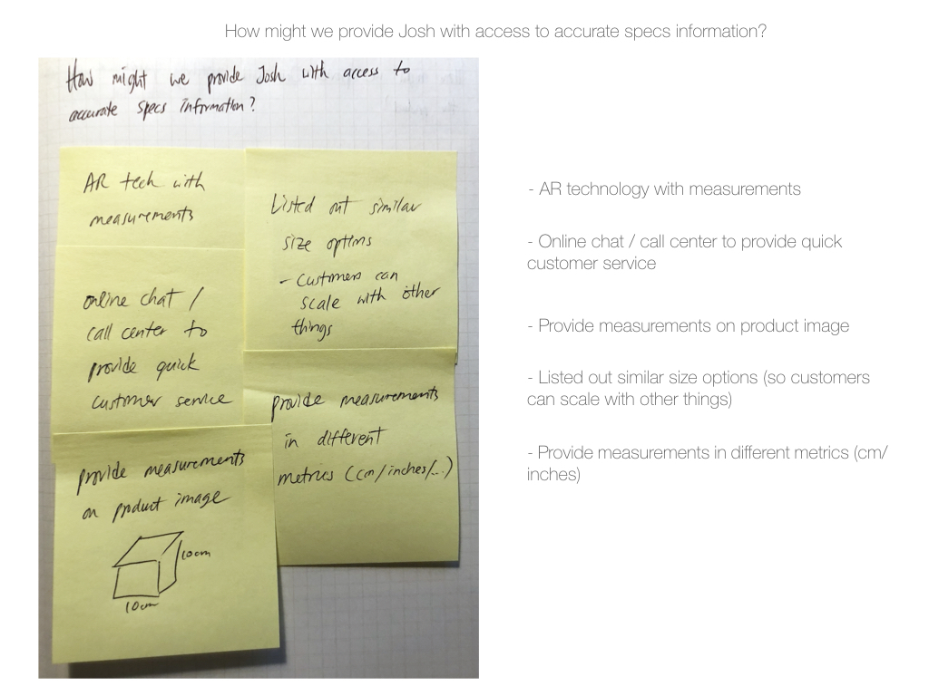
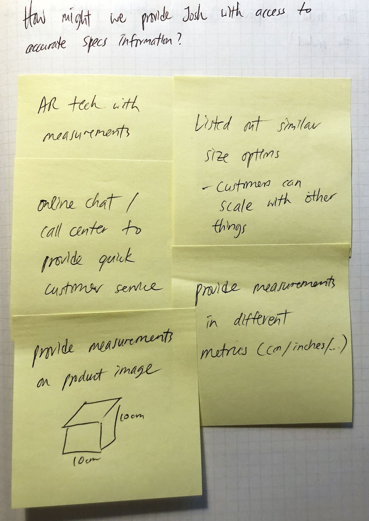
How might we provide Josh with access to accurate specs information?
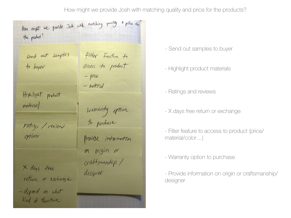
How might we provide Josh with matching quality and price for the product?
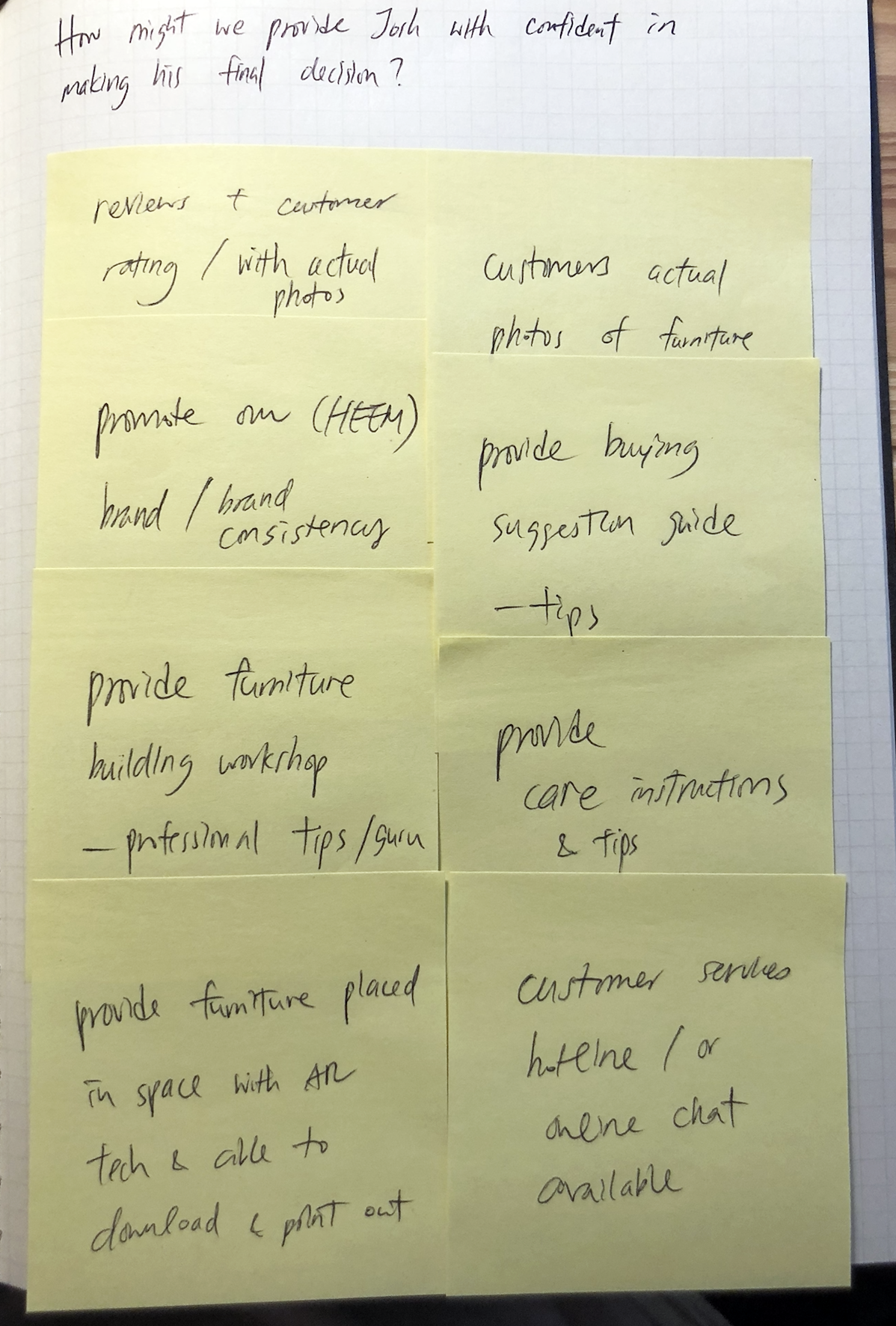
How might we provide Josh with confident in making his final purchase decision?
Base on the three HMW questions, I started to brainstorm solutions to solve user’s potential pain points.
INFORMATION ARCHITECTURE
Methods Used: Project Goals + product roadmap+sitemap
To define HEEM’s goals (business goals/user goals/ technical considerations). By doing so, I can focus on designing the site to actualize the shared goals.
Looking back at the brainstorm ideas that I have created, and now determined which goals would be in different priority then developed into insightful feature. I outlined details for each of the need and would respond to fulfill the needs of both parties.
With reference to secondary research and market analysis, I then came up with the mind map of how to design the backbone of the site. Below shown the site map for the HEEM app.
INTERACTION DESIGN & VISUAL DESIGN
Methods Used: User flow + Task flow + Sketching/Wireframes
User flow is to think through a user path to take through different scenarios and tasks. By mapping user’s journey and possible decisions, I can design the key pages and necessary steps to follow in order to complete the task with zero error.
Task flow is showcase how a user interact with the app with certain task to complete.
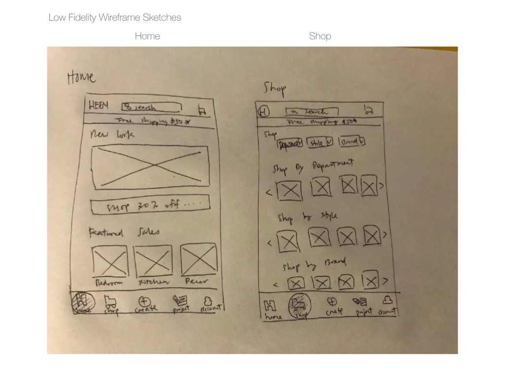
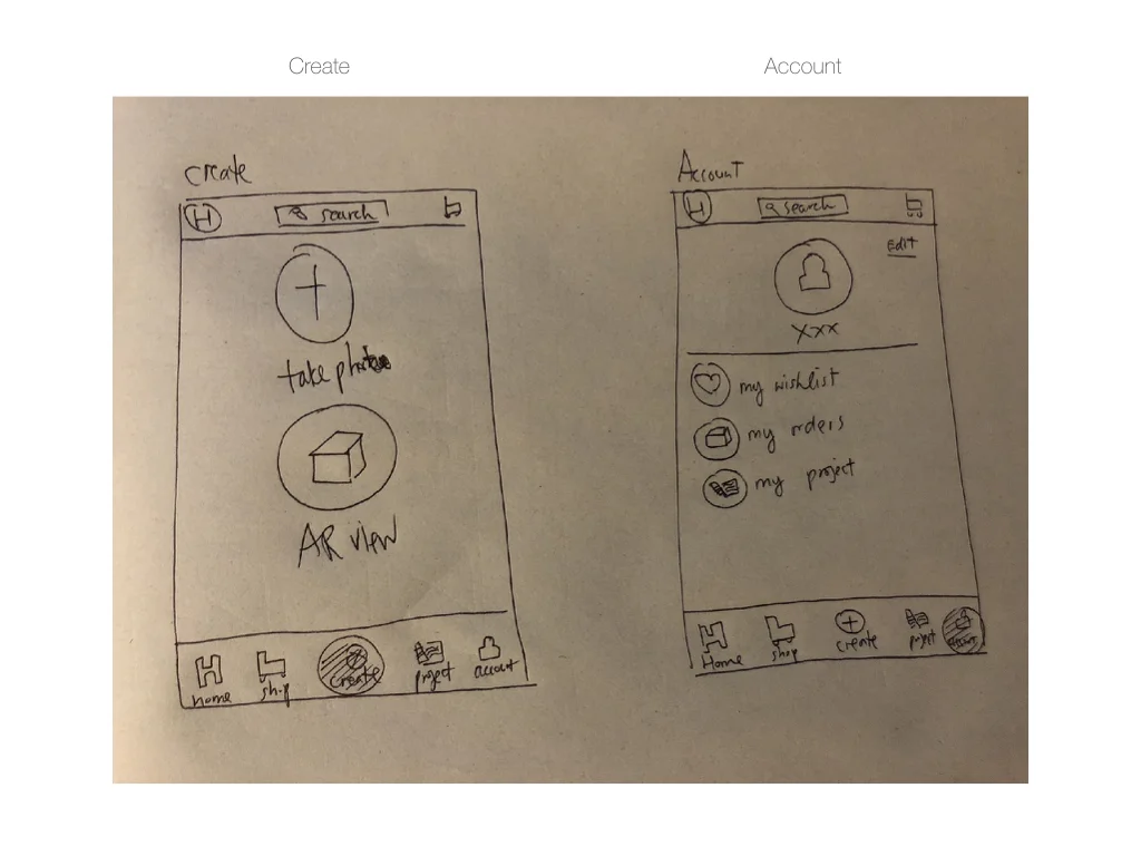
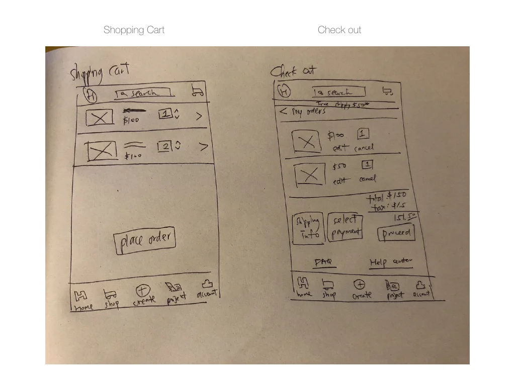
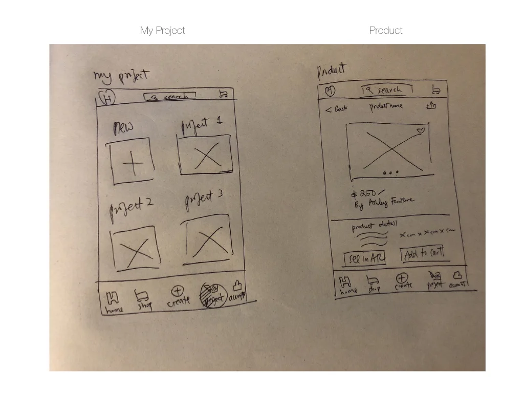
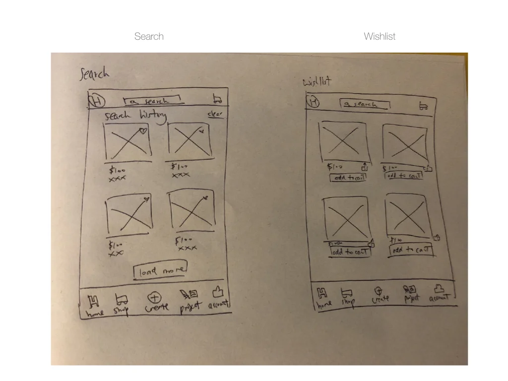
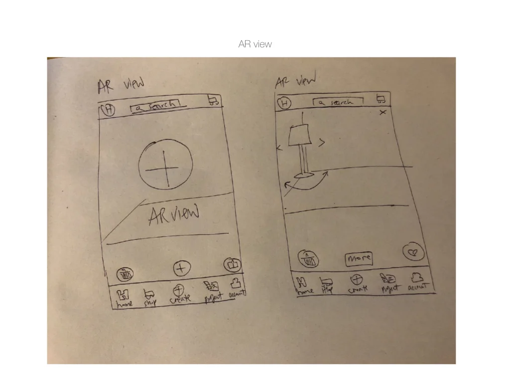
Wireframes Sketches : Before designing my mid-fidelity wireframe, I have sketched the key screens to showcase the user flow.
You can see my UI requirement list here
Next, I started to create key pages mid-fidelity wireframes to showcase the necessary steps for user’s to complete certain tasks of trying out AR view mode. Based on my previous interview results and research findings help to provide me the mindset to design necessary steps for a smooth user flow.
Wireframes : Created the key screens wireframes for HEEM’s app.
BRAND IDENTITY
HEEM is a new app created for interior home goods and furnitures and they have partnered with several top furniture stores in U.S. This app integrates their furniture catalog with augmented reality technology that allows users to view the products and to raise the possibility of making purchase decisions.
As part of the project, HEEM’s brand identity has to be designed as well to carry out their brand core messages. These are the main character that I think HEEM would want to deliver: TIMELESS/ SIMPLICITY/VALUABLE
Style Tile is created from collecting HEEM’s UI design including color palette, typography, logo and icon set.
I also collected all UI elements into a UI kit including logo, color palette, typography, actions buttons, icons and navigation bar. This UI kit helps make sure all elements are consistent throughout the app.
PROTOTYPING & TESTING
Methods Used: Usability testing & prototyping
Usability testing : This result is based on six participants with three male and three female age ranged from 26-35 years old. All tests are conducted in person with MarvelApp prototype while I watched closely how they interact with the app to perform the two tasks.
Tasks to be completed:
User needs to find wall decoration.
User need to use augmented reality view to see how does it look like and complete transaction.
You can see my usability Finding notes here.
Affinity Map: Created this tool to list out the strengths, pains, suggestions and UI design recommendations that I retrieved from the usability testing. I have put these insights and observations in order from highest to lowest priority. This gives me a broad and detailed idea of what I should be focusing on while iteration phase.
Based on the observations and feedback from participants, I have came up with 3 main insights:
Users want indications on how to use AR mode.
Users need to have access to product measurements.
Users are unclear of how to use AR mode.
High-fidelity wireframes : Based upon feedback gathered from the first mid-fidelity prototype, I created an updated, high-fidelity prototype and tested again with participants.
I created a limited function prototype in Sketch and merge into MarvelApp
PROJECT TAKEAWAYS
After working on this project, I have come to a few insightful findings including the way how users interact with a totally new app with new features. For examples, users tend to ignore the new feature since they do not understand the concept behind. The users need indications or short introduction clips to showcase how the new feature is being helpful in their product selections. Also, users enjoy the simplicity of the UI design and they are capable of completing the tasks without instructions.
NEXT STEP
Update the latest prototype based on usability testing.
Implement design recommendations based on insights gained from the usability test.
Create an usable and full functional examples for the AR view feature.
Create redline deliverables for developer to implement the app.


